
It’s a fact that paint colors affect our mood.
So what kind of message is your home sending?
How can you expect to sell a home if your exterior paint color is keeping potential buyers from even walking through the door?
Here’s our guide to the most inviting exterior color palettes.
What Makes Exterior Color Palettes Inviting?
If you want to invite others into your home, you need a color palette that welcomes you. But how do you know which colors will invite and which will repel? Think about the things that bring you the most peace.
Inviting nature scapes, water, and warm creamy foods are some of the best places to start for color inspiration. When you’re choosing a palette, stick with about three colors. Some palettes use only two or as many as four, but three usually creates the right balance.
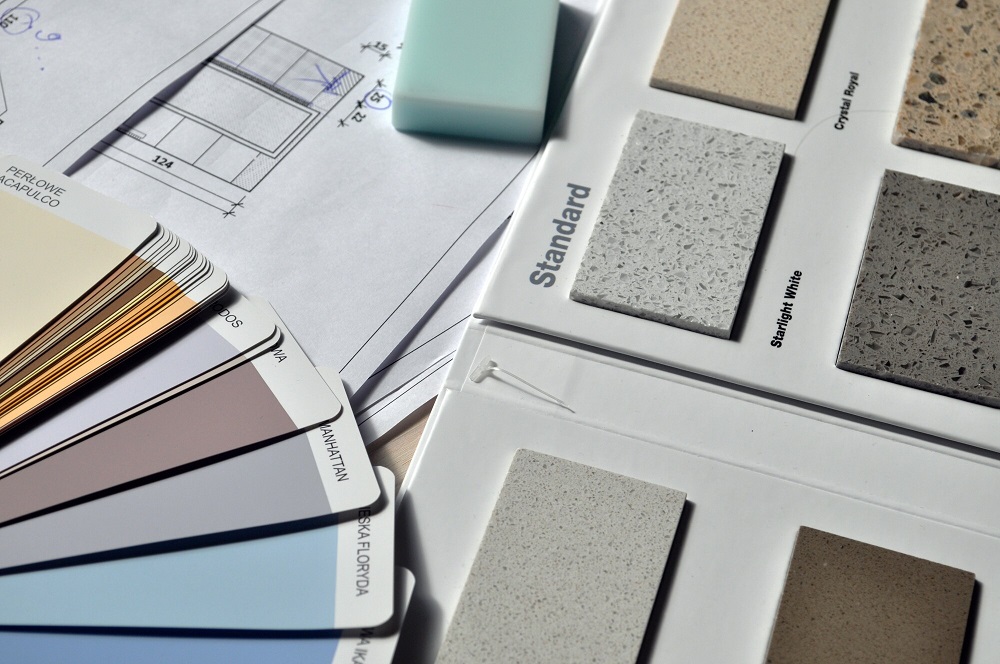
A color picker is a helpful place to start. Try: What Roof Color Should I Choose For My Boise Home? Your Color Picker Guide
- Nature Greens
Any color palette reminiscent of a sunny day in a green forest or park will invite prospective buyers. Use some version of olive, sage, or a forest green as your base. Once you have your green chosen decide if you want to…
- Stick with a multi-tonal green color palette and channel the look of leaves or shrubs. A lighter multi-tonal olive color palette is warm and welcoming. Hunter green and white with a lime accent to show-off any impressive architectural details create a modern-classic look.
Olive, ivy, and celery greens with cream have been used in Victorian home designs for over a century. Terracotta can also be added to this palette as an accent color in the windows to add more depth and highlight specific features.
- Incorporate brown with green and a light neutral like white or cream for a deeper forest vibe. Light or darker greens blend well with different tones of warm browns and white-based neutrals. Play around with the contrast between light and dark with browns and greens.
Choose browns with complementary undertones to the green you choose. For example, chocolate and russet pair well with mossy greens. Rusty browns contrast seamlessly with piney greens.
Bright whites make this color palette bold. Muted off-whites make color palettes like this cozier.
- Use a sunny yellow with a light neutral like white or cream to transport onlookers to a cloudless day outdoors. Sage paired with pale or wheaty yellows is nearly a guaranteed win every time. Think of the sun reflecting on tall meadowy grasses.
The idea of yellow and green on a house might seem scary. You don’t want to look like a sports team logo. But the key here is choosing a neutral “yellow” that lures visitors in. A creamy white can also be added.
- Beach Life
Nature doesn’t get it wrong. If green isn’t your thing, channel your wanderlust through a beachy color palette.
Lakehouses can especially benefit from a beachy color palette that draws from the natural surrounding colors. But a beachy palette that channels Key West or Cape Cod will also invite potential buyers.
Any variation of seafoam, teal, turquoise, or aquamarine paired with white will create an instant-vacation beach vibe. If you’re concerned that the gem-like blues of the Caribbean will be too bold, choose more muted tones.
For a more Mid-Atlantic look, add navy. Navy feels traditional. When it’s used with neutral whites and lighter blues it’s especially welcoming.
Another combination that always pleases is blue and grey. The key when choosing a grey is to stick with one with a warmer undertone. We love grey because it’s one of the best colors for harmonizing cozy vibes with modern times.
Think of warm, stone-like greys that you would find on the shore like greige and pearl grey. If you want to create a bolder look with grey, opt for slate blue or cobalt accents.
- Brick House
Your house doesn’t have to be made of brick to get the same cozy, inviting feeling of a traditional brick home. Different combinations of reds, blacks, and greys will do the trick.
Red and black are an instant-classic that communicates warmth and class. Red and black with a warm grey like taupe creates even more warmth, but also creates a crispness that brings the palette into the modern age.
For a brighter look, swap out black for a neutral white. Brick-red with grey and white creates the same classic warmth as black. If you’re not feeling black or grey, it doesn’t get more All-American than navy with brick red and white.
Warm spicy color palettes can also create the effect of brick. Paprika with Gingerbread orange, nutmeg, and brown takes this brick-look in a completely different direction.
- Black and White-ish
It doesn’t get much simpler than black and white. Black and white is a timeless but versatile color palette that conveys tradition and fashion. Black and white stand out and intrigues visitors.
A black and white paint pairing is bold, but adding a warm grey to the palette can soften the look. A touch of taupe brings crisp, chic black, and white down to earth.
If you love the idea of black and white but want to add some color, go with one of the best exterior paint choices: blue. Blue is calming and welcoming. A light country blue or classic navy added to this palette makes it more friendly.
On the opposite end of the spectrum, you could add color to a black and white color palette with a creamy yellow. Muted buttercream softens the intensity of bright white and creates a bridge of color between the surrounding greenery and the home.
Home Exterior Color Bottom Line
Browsing through all of the color swatch options available at any home store is sure to overwhelm you with options. But, using any of the exterior color palettes in this article as a starting place will help save you a lot of time and energy.
Looking for more ways to set the right mood in your home? Click over to our home page for the latest tips and trends in home design and remodeling.
Comments are closed.